A year into my PhD my supervisor Sune Lehmann presented me with a puzzling contradiction within the study of how humans move from place to place. Geographers mostly agreed with the common sense notion that the distances humans travel between places belong to different scales. We can move between rooms thus traveling at the scale of the building, between buildings at the scale of the city, between cities at region scale and so on. The contradiction, he pointed out, arose because recent work in physics analysing human travel distances from cell phone data found no evidence of scales. The physicsists showed that travel distances were distribution as a power-law, characteristic for its lack of scale.
Well-established geography and modern physics were in disagreement, and we grew obsessed with resolving this paradox. We wanted to show that with large enough amounts of sufficiently resolved GPS data we could indeed find scales in human mobility. We wanted to describe their average sizes, understand how freqently they were traveled at by different types of people and much more. Our leading assumption was that the scale-free result was simply an artifact of aggregation. Laura Alessandretti joined our research group as a postdoc and shared our obsession immediately. Thus began an intense and exciting adventure.
Here is a crude account. First, we wrote a comprehensive and very useful software package for finding stop-locations in sequencial GPS data. This enabled us to take raw GPS sequences and turn them into sequences of place names. We then discovered that plotting the distribution of distances traveled for an individual did clearly not yield a power-law distribution, but rather showed with great clarity the different scales that they traveled at. Now, we just needed a model for assign scale to journeys. Thus followed a series of wild but fruitless ideas. Initially, we believed the key to labeling trips was to understand their context, so we developed a grammer of nested trips in location sequences and a measure of location "starness". We could now identify whether a place in a sequence of visited places was a keystone place where trips start and end—a location where one, for example, drops ones stuff, takes off from, and returns to—or simply an intermediate location within a trip—like a shop visit on the way or a gas station. Writing this, I wonder what the hell we were thinking, but at the time I am sure we saw some connection to the greater problem of inferring scale of mobility events.
The breakthroughs came when we started thinking about human travel simply as movements between containers in a nested hiearchy. This idea had come up early in the initial fog of ideas, but seemed out of reach for quick testing. Eventually, however, we developed a dead simple simulating of travel on a nested grid. This simulation brought us immense insight. The traces it generated looked real, and reproduced the scale-ful distributions of travel distances we observed in our initial plots. Having implemented it in a fast interactive framework, we could tweak parameters and understand their influence on dynamics. Based on this, we could write an equation for the probability of moving from one place to another given a hierarchy of containers:
\[ P_{H,\mathbf{a},\mathbf{p}}(j \to k) = \prod_{l=1}^{\,d(j,k)-1} a(k_l)\,, \]This equation is basically the whole paper. It encodes all of our assumptions about how humans move between places (and if you want to fully understand it, reading the text around equation (1) in the paper is where to begin).
We were stuck in the grid-mindset for a little while and stuggled with translating it to real human travel data. First, we tried to fit a spherical nested grid onto the globe... again, I don't know what the hell we were thinking, and though it worked in the computer the results were rediculous and obviously constrained by the grid. Having slept on it for a sufficient number of night we realized that we did not need a grid, and could use our equation to estimate the probability of a movement given any hierarchy of containers. We then devised a method for iterating over all possible linkage clustering solutions, estimating likelihood and picking the best one.
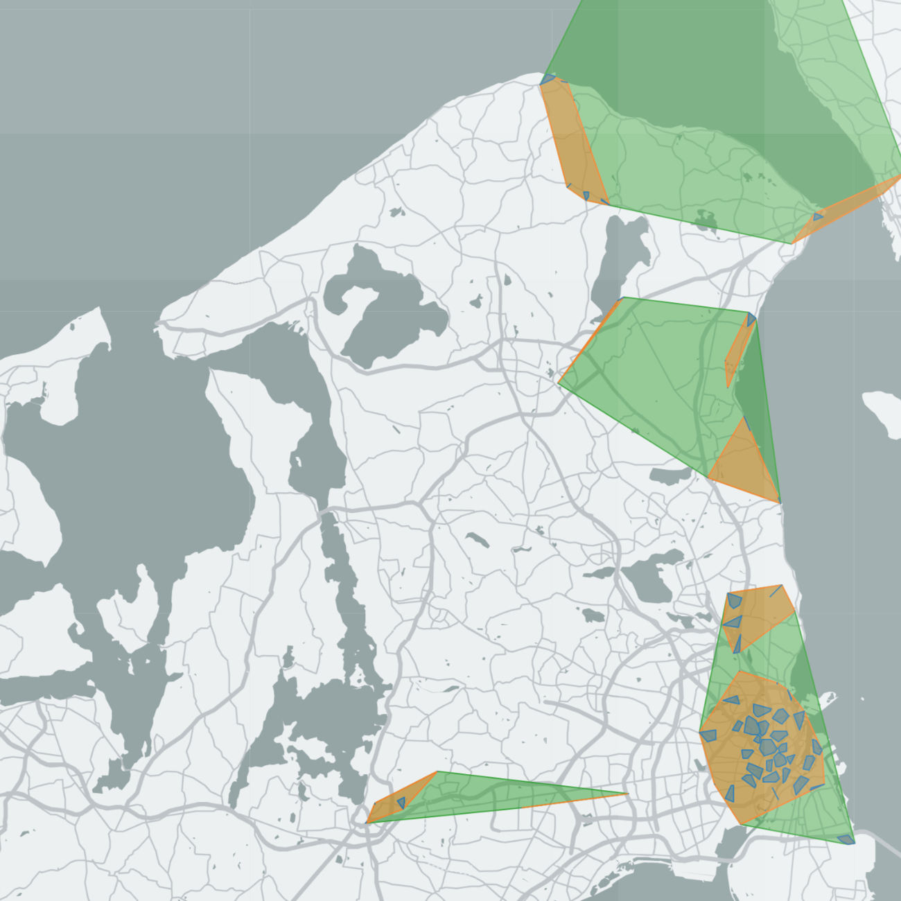
In pragmatic terms, what we ended up making was a clustering method. Where most clustering methods take as input just a collection of points, our method takes as input a collection of points and a sequence of moves between them. Its output is a nested partition of places into containers, as well as a scale labeling of each individual movement. It optimizes the partition using maximum likelihood estimation. When visualized on a map, containers typically resemble known neighborhoods, cities, urban agglomeration, regions, countries, and continents.
How does this resolve Sune's contradiction? Through a number of tests we show that the containers and scales our method consistently finds for tens of millions of individuals across the world are non-artifactual, but strictly a property of the data. For example, if we simulate scale-free traces with the EPR model the method finds no scales. We also show that the scale-free result of earlier research can easily emerge when we aggregate over scales.
→ Here's the paper (Nature / ArXiv)
But to me, the most important result is just that it works. I could plug my own GPS data in there and recover the containers I normally identify as home, neighborhoods, cities and regions. I even tried my mom's (yes I tracked my mom) and she could look at it and tell me what each container meant. Below is (some of) my own containers visualized on a map. If you stare it at it long enought you can learn a lot about how I live.